Mix Acrylic Paint Colors for Beginners: A Step-by-Step Guide
· Editorial Team · 14 min read
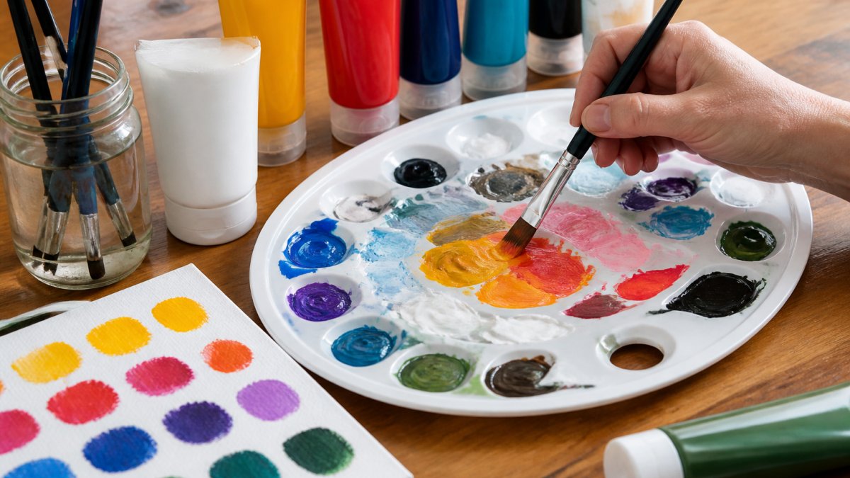
Table of Contents
- Understanding Color Theory Basics
- What You'll Need Before You Start Mixing
- Step-by-Step: How to Mix Acrylic Paint Colors
- Using an Acrylic Paint Color Mixing Chart
- How to Mix Teal Acrylic Paint: A Practical Recipe
- How to Mix Pink Acrylic Paint: From Soft to Bold
- How to Avoid Muddy Colors When Mixing Paint
- Common Mistakes to Avoid When Mixing
- Frequently Asked Questions
Last Updated: October 13, 2026
Understanding Color Theory Basics
Color mixing isn't magic. It's a system. Once you understand how colors work together, mixing acrylics becomes straightforward and predictable.
The foundation starts with understanding primary, secondary, and tertiary colors. These categories form the backbone of every color you'll ever mix. Knowing how they relate to each other eliminates guesswork and saves you from wasting paint on failed attempts.
Primary, Secondary, and Tertiary Colors
Primary colors are red, blue, and yellow. These three colors cannot be made by mixing other colors together. They're your starting point.
Secondary colors are created by mixing two primary colors:
- Red + Yellow = Orange
- Yellow + Blue = Green
- Blue + Red = Purple (or violet)
Tertiary colors come from mixing a primary color with a secondary color. For example, red-orange or blue-green. These give you the full spectrum of hues available on a standard color wheel.
Understanding this hierarchy matters because it shows you what's possible. If you want teal, you know you need blue and green (or blue, yellow, and a touch of red). If you want coral, you're mixing red with orange. The color wheel isn't decorative, it's a map of how colors relate.
Hue, Value, and Saturation Explained
Three terms control how your colors look: hue, value, and saturation.
Hue is the color itself, red, blue, green, yellow. When you say "I want a warmer blue," you're talking about shifting the hue toward red or yellow.
Value refers to how light or dark a color is. A light blue has high value. A dark blue has low value. This matters more than most beginners realize.
Saturation describes how pure or intense a color is. A bright, vivid red is highly saturated. A muted, dusty red has low saturation.
These three properties work together. Adjusting any one of them changes how your color looks on the canvas.
What You'll Need Before You Start Mixing
Gather these supplies before you begin. Having everything ready prevents frustration and keeps your workflow smooth.
Essential supplies:
- Acrylic paints (at least primary colors: red, blue, yellow)
- Mixing palette (ceramic, plastic, or glass)
- Brushes (round and flat shapes)
- Water cup for rinsing
- Paper towels or cotton rags
- Small containers for testing colors
- White paint (for tinting and lightening)
- Black paint (optional, for darkening, use sparingly)
Optional but helpful:
- Color mixing chart or reference guide
- Notebook for recording your mixing ratios
- Spray bottle with water (keeps paint from drying too fast)
- Palette knife (for mixing thick paint)
The palette is your workspace. A ceramic tile, a white ceramic plate, or a proper mixing palette all work. White surfaces matter because they show you true colors without distortion. Dark palettes make it harder to see what you're actually mixing.
Keep water nearby but separate from your mixing area. Dirty water muddies colors fast. Change your water frequently, every few minutes if you're mixing multiple colors.
Step-by-Step: How to Mix Acrylic Paint Colors
Learning how to mix acrylic paint colors follows a repeatable process. Once you practice this method a few times, it becomes automatic.
Step 1: Set Up Your Palette and Gather Your Paints
Arrange your paints around the edge of your palette. Leave the center open for mixing. Squeeze out small amounts, roughly the size of a pea or chickpea. You can always add more paint. Wasting paint by squeezing too much happens to everyone.
Group colors logically. Put your reds together, blues together, and yellows together. This organization saves time when you're reaching for a specific hue.
If you're using PaintPrompt to plan your class, the color list tells you exactly which paints you'll need. This eliminates last-minute scrambling and ensures every student has the right colors available.
Step 2: Start with Small Amounts
This is the most common beginner mistake: mixing too much paint at once.
Start with a tiny amount of your base color, the dominant color in your mix. If you're making teal, start with blue because blue will be the main color. Add small touches of the secondary color (green or yellow) to shift the hue.
Small additions give you control. You can always add more. You cannot remove paint once it's mixed. A dime-sized blob of blue with a rice-grain-sized touch of yellow gives you far more control than starting with two equal amounts.
This patience saves paint and prevents frustration. Most failed mixes come from adding too much of a secondary color too quickly.
Step 3: Mix and Test on a Swatch
Mix your colors thoroughly on the palette. Use a brush or palette knife to blend until the color is uniform. No streaks. No swirls of unmixed paint.
Once mixed, test the color on paper or canvas, not on your final piece. Paint a small swatch. Let it dry completely. Acrylic paint dries darker and slightly different than it appears wet. This drying shift is real and predictable. A wet mix that looks perfect might dry too dark or too dull.
Testing prevents disaster. You discover problems on a test swatch, not on your finished painting.
Step 4: Adjust and Record Your Mixing Ratio
If your test swatch isn't quite right, adjust. Too dark? Add white or more of the lighter color. Too dull? Add a touch of the complementary color's opposite to brighten it. Too warm? Add a cooler tone.
Make small adjustments. One tiny addition at a time.
Record what you did. Write down the ratio: "3 parts blue + 1 part yellow = teal." This record becomes your reference guide. Next time you need that exact teal, you have the recipe. No guessing. No starting from scratch.
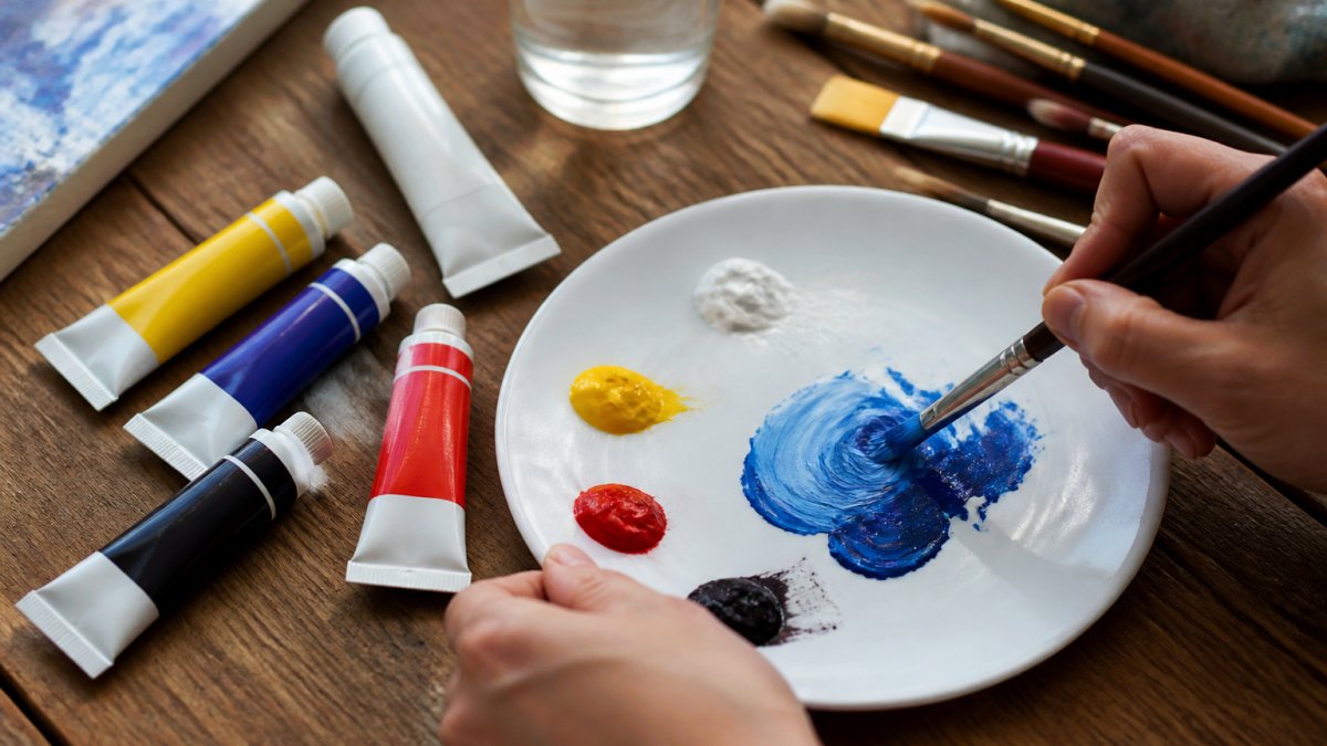
Using an Acrylic Paint Color Mixing Chart
A color mixing chart is a reference tool that shows you what happens when you combine specific colors in specific ratios. It's not a rule book, it's a starting point.
Professional color mixing charts display primary colors down one side and across the top. Where they intersect, you see the result of mixing those two colors in equal parts.
Creating your own chart is valuable. Mix small swatches of color combinations and paste them into a notebook with the ratios written below.
Many instructors and studio owners use charts to teach students. When you're planning classes with tools like PaintPrompt, the included color list and mixing guidance save you from building charts from scratch.
How to Mix Teal Acrylic Paint: A Practical Recipe
Teal is a blue-green color that sits between pure blue and pure green on the color wheel. It's popular in landscapes and modern paintings.
Basic teal recipe:
- Start with 3 parts blue (your base)
- Add 1 part green (or 1 part yellow + a touch of blue to create green)
- Adjust with white if you want a lighter teal
If you don't have green paint, mix it first: combine yellow and blue in equal parts. Then use that green in your teal mix.
The ratio matters less than the direction. More blue makes it darker and more blue-leaning. More green makes it brighter and more cyan-like. Test on a swatch. Let it dry. Adjust if needed.
For a softer, muted teal, add a tiny touch of its complementary color (red-orange). This desaturates the teal slightly, making it less neon and more natural-looking.
How to Mix Pink Acrylic Paint: From Soft to Bold
Pink is red + white. That's the foundation. Everything else is adjustment.
Soft pink recipe:
- 1 part red
- 3-4 parts white
- Optional: tiny touch of blue or purple for a cooler tone
Bold pink recipe:
- 2 parts red
- 1 part white
- Optional: touch of yellow for a warmer, more coral-like pink
The difference between soft and bold is the ratio of white to red. More white = softer. Less white = bolder.
If your pink looks too orange, add a touch of blue to cool it down. If it looks too purple, add a touch of yellow to warm it up. These tiny adjustments shift the temperature without changing the fundamental pink.
Test every mix. Pink is deceptive. What looks pale and delicate wet often dries slightly darker. A mix that seems right might need more white once it's fully dry.
How to Avoid Muddy Colors When Mixing Paint
Muddy colors are the result of over-mixing, wrong color combinations, or too much complexity in a single mix. They look dull, brownish, or lifeless, the opposite of vibrant.
Why Colors Turn Muddy
Muddy colors happen for specific reasons, and understanding them prevents the problem.
Too many colors in one mix. Each color you add dilutes the purity of the others. Mixing three or four colors together often creates mud.
Complementary colors canceling each other out. Red and green are complementary (opposites on the color wheel).
Dirty water or contaminated brushes. If your water is brown and cloudy, it's contaminating every color you mix. Change your water frequently. Rinse brushes thoroughly between colors.
Using black to darken. Black is powerful and deadens colors quickly. A tiny touch of black in a bright red creates a muddy, dead brown.
Strategies to Keep Your Mixes Bright and Clean
Bright, clean colors come from intentional mixing and smart choices.
Limit your mix to two colors. Blue + yellow = green. Red + yellow = orange. Two colors stay vibrant.
Use white to lighten, not water. Water dilutes the pigment and weakens the color. White maintains the color's intensity while making it lighter.
Test before committing. Paint a swatch on scrap paper. Let it dry.
Keep complementary colors separate. If you need to desaturate a color intentionally, add a touch of its complement. But know you're doing it.
Use a limited palette. The fewer colors you have available, the fewer muddy combinations you can accidentally create. A limited palette forces intentional mixing.
Common Mistakes to Avoid When Mixing
Most beginner painters make the same mistakes repeatedly.
Not testing colors before using them. Wet paint looks different than dry paint.
Using black to darken colors. Black kills vibrancy.
Assuming all reds (or blues, or yellows) are the same. They're not.
Mixing on a dark palette. You can't see true colors on dark surfaces.
Adding water instead of white to lighten. Water weakens the pigment.
Giving up after one failed mix. Every failed mix teaches you something. Adjust and try again.
Learning to mix acrylic paint colors is a skill that improves with practice.
If you're teaching others or planning classes, having structured guidance makes all the difference.
Frequently Asked Questions
How do you mix acrylic paint colors as a beginner?
Start by understanding the color wheel: primary colors (red, blue, yellow) mix to create secondary colors (orange, green, purple). Use small amounts of paint, blend thoroughly on your palette, and always test on a swatch before applying to your canvas. Keep a mixing log with your ratios so you can repeat successful colors. Practice with limited palettes first to build confidence before experimenting with complex mixes.
What colors make teal acrylic paint?
Mix blue and green to create teal, or combine blue with a small amount of yellow and white. Start with more blue than green, then adjust the ratio until you reach your desired shade. For a lighter teal, add white. For a deeper teal, use less white and more blue. Test your mix on a swatch and let it dry completely, as acrylic paint darkens as it dries.
How can you avoid muddy colors when mixing acrylic paint?
Muddy colors result from mixing too many colors together or using complementary colors. Limit yourself to mixing two or three colors maximum. Use high-quality pigments with good opacity. Avoid mixing warm and cool versions of the same color. Keep your palette clean between mixes. If your color turns dull, add white to brighten it or start fresh rather than continuing to adjust.
How do you make a mixed acrylic color lighter or darker?
To lighten any acrylic paint mix, add white in small increments and blend thoroughly. To darken, add black sparingly or use a darker version of one of your base colors. Remember that acrylic dries darker than it appears wet, so test your adjustment on a swatch and let it dry before applying to your painting. Keep notes on how much white or darkener you added so you can replicate the shade later.